Interpolation#
In this lecture, we’ll learn how to estimate values between known data points — a fundamental technique in computational physics.
Why Interpolation?#
Experimental data is measured at discrete points, but physics is continuous
We need to estimate values between measurements
Creating smooth curves through data for visualization
Building functions from tabulated data (e.g., material properties)
import numpy as np
import matplotlib.pyplot as plt
from scipy import interpolate

# For nicer plots
plt.rcParams['figure.figsize'] = [6, 4]
plt.rcParams['font.size'] = 10
I. The Interpolation Problem#
Given \(n+1\) data points \((x_0, y_0), (x_1, y_1), \ldots, (x_n, y_n)\), find a function \(f(x)\) such that:
The function \(f(x)\) passes exactly through all data points.
Interpolation vs. Curve Fitting#
Interpolation |
Curve Fitting (Regression) |
|---|---|
Passes through ALL points |
Minimizes overall error |
No measurement error assumed |
Accounts for noise |
Good for exact data |
Good for noisy data |
Can oscillate wildly |
Smoother results |
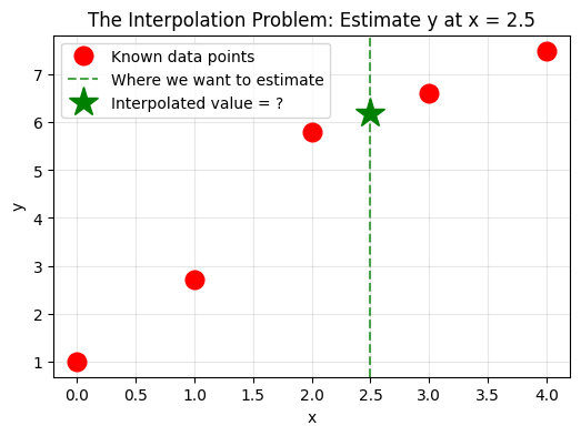
# Visualize the interpolation problem
# Given these data points, what's the value at x=2.5?

x_data = np.array([0, 1, 2, 3, 4])
y_data = np.array([1, 2.7, 5.8, 6.6, 7.5])

plt.figure(figsize=(6, 4))
plt.plot(x_data, y_data, 'ro', markersize=12, label='Known data points')
plt.axvline(x=2.5, color='g', linestyle='--', alpha=0.7, label='Where we want to estimate')
plt.plot(2.5, 6.2, 'g*', markersize=20, label='Interpolated value = ?')

plt.xlabel('x')
plt.ylabel('y')
plt.title('The Interpolation Problem: Estimate y at x = 2.5')
plt.legend()
plt.grid(True, alpha=0.3)
plt.show()
II. Linear Interpolation#
The simplest approach: connect adjacent points with straight lines.
For a point \(x\) between \(x_i\) and \(x_{i+1}\):
This is just the equation of a line through two points! The slope is:
This is exactly what we used in the trapezoidal rule for integration.
# First, let's implement linear interpolation from scratch
def linear_interp(x_data, y_data, xnew):
    """
    Linear interpolation - implemented from scratch.

    Parameters:
        x_data: array of x coordinates of known points
        y_data: array of y coordinates of known points
        xnew: the x value where we want to interpolate

    Returns:
        Interpolated y value at xnew
    """
    # Step 1: Find the interval where xnew falls
    # We need to find i such that x_data[i] <= xnew <= x_data[i+1]
    i = 0
    while xnew > x_data[i+1]:
        i += 1

    # Step 2: Calculate the slope (coefficient a in y = ax + b)
    a = (y_data[i+1] - y_data[i]) / (x_data[i+1] - x_data[i])

    # Step 3: Calculate the intercept
    b = y_data[i] - a*x_data[i]

    # Step 4: Evaluate at the new point
    ynew = a*xnew + b

    return ynew

# Test with simple data: y = x^2
x = [1, 2, 3, 4]
y = [1, 4, 9, 16]

print("Testing our linear interpolation:")
print(f"Known points: x = {x}, y = {y}")
print(f"Interpolated value at x=2.5: {linear_interp(x, y, 2.5)}")
print(f"True value (2.5²): {2.5**2}")
Testing our linear interpolation:
Known points: x = [1, 2, 3, 4], y = [1, 4, 9, 16]
Interpolated value at x=2.5: 6.5
True value (2.5²): 6.25
# Visualize linear interpolation on sin(x)
from math import pi

f = lambda x: np.sin(x)
x_min, x_max = 0, pi
npt_ideal = 100  # Points for ideal function
npt_known = 4    # Available data points

x_ideal = np.linspace(x_min, x_max, npt_ideal)
x_known = np.linspace(x_min, x_max, npt_known)
y_known = f(x_known)

# Use our linear interpolation
x_interp = np.linspace(x_min + 0.01, x_max - 0.01, 50)
y_interp = np.array([linear_interp(x_known, y_known, xi) for xi in x_interp])

plt.figure(figsize=(6, 4))
plt.plot(x_ideal, f(x_ideal), 'b-', linewidth=2, label='True function: sin(x)')
plt.scatter(x_known, y_known, color='r', s=100, zorder=5, label='Known data points')
plt.plot(x_interp, y_interp, 'g--', linewidth=2, label='Linear interpolation')

plt.legend()
plt.xlabel('x')
plt.ylabel('y')
plt.title('Linear Interpolation: Connecting Points with Straight Lines')
plt.grid(True, alpha=0.3)
plt.show()

print("Notice: Linear interpolation creates 'corners' at data points - it's not smooth!")
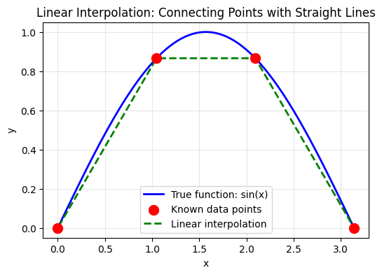
Notice: Linear interpolation creates 'corners' at data points - it's not smooth!
Pros and Cons of Linear Interpolation#
Pros:
Simple and fast
Always stable (no oscillations)
Works well for many practical cases
Cons:
Not smooth — derivative is discontinuous at data points
May not capture curved behavior well
III. Polynomial Interpolation#
Fact: Given \(n+1\) distinct points, there exists a unique polynomial of degree at most \(n\) that passes through all points.
Lagrange Interpolation#
The Lagrange form expresses the interpolating polynomial as:
where the Lagrange basis polynomials are:
Key property: \(L_i(x_j) = \delta_{ij}\) (1 if \(i=j\), 0 otherwise)
Advantages:
Simple to understand and implement
Directly constructs a polynomial through all data points
Disadvantages:
Computational cost increases with number of points
Not easily extendable if new points are added
# Implement Lagrange interpolation from scratch
def lagrange_interpolation(x_points, y_points, x_value):
    """
    Compute the Lagrange interpolated value at x_value.

    The Lagrange polynomial is:
    P(x) = Σ y_j * L_j(x)

    where L_j(x) = Π (x - x_i)/(x_j - x_i) for i ≠ j

    Parameters:
        x_points: array of x coordinates of data points
        y_points: array of y coordinates of data points
        x_value: the x value at which to evaluate

    Returns:
        Interpolated y value at x_value
    """
    total = 0.0
    n = len(x_points)
    for i in range(n):
        # compuite L_i
        Li = 1.0
        for j in range(n):
            if j != i:
                Li = Li * (x_value - x_points[j]) / (x_points[i] - x_points[j])
        total = total + Li * y_points[i]

    return total

# Example data points
x_points = np.array([0, 1, 2, 3, 4])
y_points = np.array([1, 2, 0, 2, 3])

# Create points for plotting
x_new = np.linspace(min(x_points), max(x_points), 100)
y_new = [lagrange_interpolation(x_points, y_points, xv) for xv in x_new]

# Plotting
plt.figure(figsize=(6, 4))
plt.plot(x_points, y_points, 'ro', markersize=12, label='Data Points')
plt.plot(x_new, y_new, 'b-', linewidth=2, label='Lagrange Polynomial')
plt.xlabel('x')
plt.ylabel('y')
plt.title('Hand-Implemented Lagrange Interpolation')
plt.legend()
plt.grid(True, alpha=0.3)
plt.show()

print(f"Lagrange interpolation at x=2.5: {lagrange_interpolation(x_points, y_points, 2.5):.4f}")
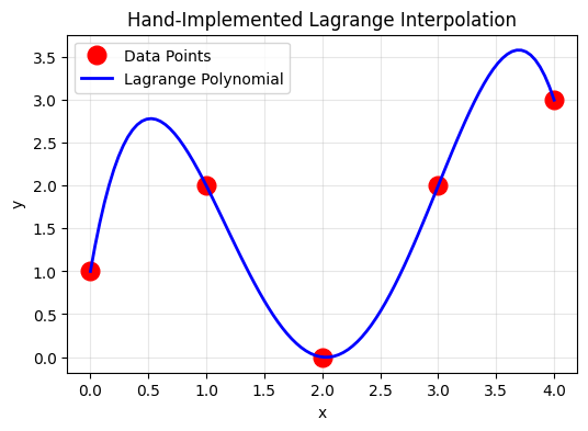
Lagrange interpolation at x=2.5: 0.5312
def lagrange_basis(x_data, i, x):
    """
    Compute the i-th Lagrange basis polynomial at x.
    """
    n = len(x_data)
    result = 1.0
    for j in range(n):
        if j != i:
            result *= (x - x_data[j]) / (x_data[i] - x_data[j])
    return result

def lagrange_interp(x_data, y_data, x):
    """
    Lagrange polynomial interpolation.
    """
    n = len(x_data)
    result = 0.0
    for i in range(n):
        result += y_data[i] * lagrange_basis(x_data, i, x)
    return result

# Visualize Lagrange basis polynomials
x_plot = np.linspace(-0.5, 4.5, 200)
x_data = x_points
y_data = y_points

plt.figure(figsize=(6, 8))

plt.subplot(2, 1, 1)
colors = ['blue', 'orange', 'green', 'red', 'purple']
for i in range(len(x_data)):
    L_i = [lagrange_basis(x_data, i, x) for x in x_plot]
    plt.plot(x_plot, L_i, color=colors[i], linewidth=2, label=f'$L_{i}(x)$')
    plt.plot(x_data[i], 1, 'o', color=colors[i], markersize=10)

plt.axhline(y=0, color='k', linewidth=0.5)
plt.axhline(y=1, color='k', linewidth=0.5, linestyle='--', alpha=0.3)
for xi in x_data:
    plt.axvline(x=xi, color='gray', linewidth=0.5, linestyle='--', alpha=0.3)
plt.xlabel('x')
plt.ylabel('$L_i(x)$')
plt.title('Lagrange Basis Polynomials')
plt.legend()
plt.grid(True, alpha=0.3)
plt.ylim(-0.5, 1.5)

plt.subplot(2, 1, 2)
# Interpolation result
y_lagrange = [lagrange_interp(x_data, y_data, x) for x in x_plot]
plt.plot(x_data, y_data, 'ro', markersize=12, label='Data points')
plt.plot(x_plot, y_lagrange, 'b-', linewidth=2, label='Lagrange polynomial')
plt.xlabel('x')
plt.ylabel('y')
plt.title('Lagrange Interpolation')
plt.legend()
plt.grid(True, alpha=0.3)

plt.tight_layout()
plt.show()

print(f"Lagrange interpolation at x=2.5: {lagrange_interp(x_data, y_data, 2.5):.4f}")
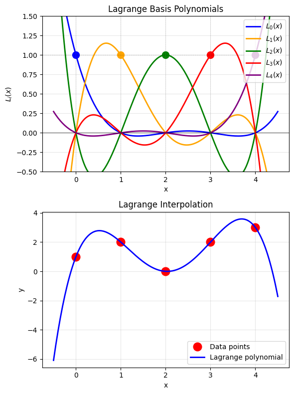
Lagrange interpolation at x=2.5: 0.5312
Newton’s Divided Difference Form#
An equivalent but more efficient form:
where \(a_i\) are the divided differences:
Advantage: Adding a new point only requires computing one new coefficient!
def divided_differences(x_data, y_data):
    """
    Compute divided difference coefficients.
    """
    n = len(x_data)
    # Create divided difference table
    dd = np.zeros((n, n))
    dd[:, 0] = y_data

    for j in range(1, n):
        for i in range(n - j):
            dd[i, j] = (dd[i+1, j-1] - dd[i, j-1]) / (x_data[i+j] - x_data[i])

    return dd[0, :]  # First row contains the coefficients

def newton_interp(x_data, y_data, x):
    """
    Newton's divided difference interpolation.
    """
    coeffs = divided_differences(x_data, y_data)
    n = len(x_data)

    # Evaluate polynomial using Horner's method
    result = coeffs[-1]
    for i in range(n-2, -1, -1):
        result = result * (x - x_data[i]) + coeffs[i]

    return result

# Test Newton interpolation
coeffs = divided_differences(x_data, y_data)
print("Divided difference coefficients:")
for i, c in enumerate(coeffs):
    print(f"  a_{i} = {c:.4f}")

print(f"\nNewton interpolation at x=2.5: {newton_interp(x_data, y_data, 2.5):.4f}")
print(f"Lagrange interpolation at x=2.5: {lagrange_interp(x_data, y_data, 2.5):.4f}")
print("(They should be identical!)")
Divided difference coefficients:
  a_0 = 1.0000
  a_1 = 1.0000
  a_2 = -1.5000
  a_3 = 1.1667
  a_4 = -0.5000

Newton interpolation at x=2.5: 0.5312
Lagrange interpolation at x=2.5: 0.5312
(They should be identical!)
The Danger of High-Degree Polynomials: Runge’s Phenomenon#
High-degree polynomial interpolation can produce wild oscillations near the edges, especially for uniformly spaced points.
# Demonstrate Runge's phenomenon
def runge_function(x):
    """The Runge function: 1/(1 + 25x²)"""
    return 1 / (1 + 25 * x**2)

x_fine = np.linspace(-1, 1, 500)
y_true = runge_function(x_fine)

plt.figure(figsize=(6, 10))

for idx, n_points in enumerate([5, 11, 21]):
    plt.subplot(3, 1, idx + 1)

    # Uniformly spaced points
    x_uniform = np.linspace(-1, 1, n_points)
    y_uniform = runge_function(x_uniform)

    # Polynomial interpolation
    y_interp = [lagrange_interp(x_uniform, y_uniform, x) for x in x_fine]

    plt.plot(x_fine, y_true, 'b-', linewidth=2, label='True function')
    plt.plot(x_fine, y_interp, 'r--', linewidth=2, label=f'Polynomial (n={n_points-1})')
    plt.plot(x_uniform, y_uniform, 'ko', markersize=6)

    plt.xlabel('x')
    plt.ylabel('y')
    plt.title(f'{n_points} points')
    plt.legend(loc='upper right')
    plt.ylim(-0.5, 1.5)
    plt.grid(True, alpha=0.3)

plt.suptitle("Runge's Phenomenon: More Points Can Make It Worse!", fontsize=14)
plt.tight_layout()
plt.show()

print("Notice: With 21 points, the interpolation is WORSE near the edges!")
print("This is Runge's phenomenon — a fundamental limitation of polynomial interpolation.")
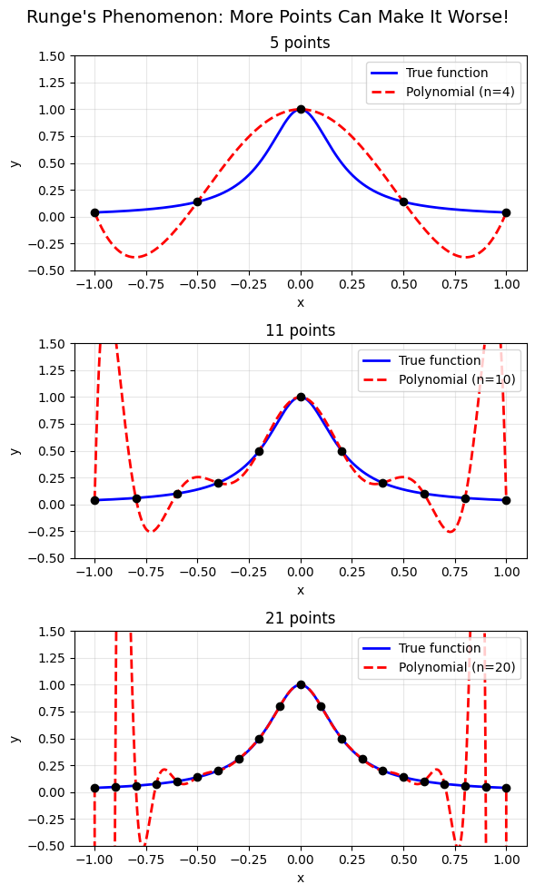
Notice: With 21 points, the interpolation is WORSE near the edges!
This is Runge's phenomenon — a fundamental limitation of polynomial interpolation.
Solution: Chebyshev Nodes#
Using non-uniform point spacing can eliminate Runge’s phenomenon:
These cluster more points near the edges.
# Compare uniform vs Chebyshev nodes
n_points = 11

# Uniform spacing
x_uniform = np.linspace(-1, 1, n_points)
y_uniform = runge_function(x_uniform)

# Chebyshev nodes
k = np.arange(n_points)
x_chebyshev = np.cos((2*k + 1) / (2*n_points) * np.pi)
x_chebyshev = np.sort(x_chebyshev)  # Sort for plotting
y_chebyshev = runge_function(x_chebyshev)

# Interpolate
y_interp_uniform = [lagrange_interp(x_uniform, y_uniform, x) for x in x_fine]
y_interp_chebyshev = [lagrange_interp(x_chebyshev, y_chebyshev, x) for x in x_fine]

plt.figure(figsize=(6, 8))

plt.subplot(2, 1, 1)
plt.plot(x_fine, y_true, 'b-', linewidth=2, label='True function')
plt.plot(x_fine, y_interp_uniform, 'r--', linewidth=2, label='Polynomial')
plt.plot(x_uniform, y_uniform, 'ko', markersize=8)
plt.xlabel('x')
plt.ylabel('y')
plt.title(f'Uniform Spacing ({n_points} points)')
plt.legend()
plt.ylim(-0.5, 1.5)
plt.grid(True, alpha=0.3)

plt.subplot(2, 1, 2)
plt.plot(x_fine, y_true, 'b-', linewidth=2, label='True function')
plt.plot(x_fine, y_interp_chebyshev, 'g--', linewidth=2, label='Polynomial')
plt.plot(x_chebyshev, y_chebyshev, 'ko', markersize=8)
plt.xlabel('x')
plt.ylabel('y')
plt.title(f'Chebyshev Nodes ({n_points} points)')
plt.legend()
plt.ylim(-0.5, 1.5)
plt.grid(True, alpha=0.3)

plt.tight_layout()
plt.show()

print("Chebyshev nodes cluster near the edges, reducing oscillations!")
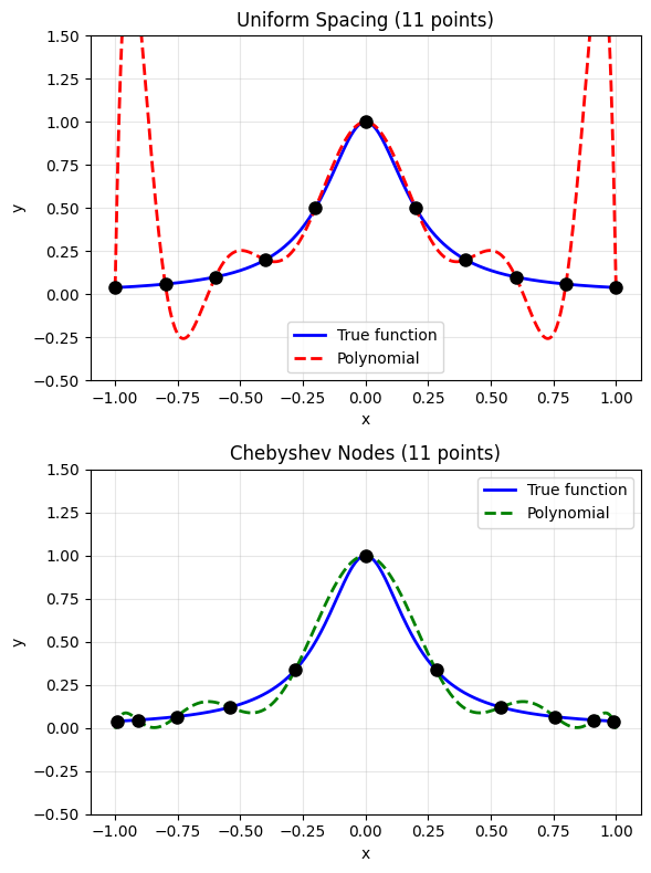
Chebyshev nodes cluster near the edges, reducing oscillations!
IV. Spline Interpolation#
Instead of one high-degree polynomial, use piecewise low-degree polynomials joined smoothly.
Linear spline is actually the simplest version of spline interpolation: $\(S_i(x) = y_i + \frac{y_{i+1}-y_i}{x_{i+1}-x_i}(x-x_i)\)$
But it’s not smooth at the data points (the derivative is discontinuous).
Quadratic Spline Interpolation#
To make a smoother curve, we can use quadratic polynomials between each pair of points:
Example: Consider three points: \((-1, 0), (0, 1), (1, 3)\)
We want to find two quadratic pieces: $\(p_1(x) = a_1 + b_1 x + c_1 x^2 \quad \text{on } [-1, 0]\)\( \)\(p_2(x) = a_2 + b_2 x + c_2 x^2 \quad \text{on } [0, 1]\)$
Conditions:
\(p_1(-1) = 0\) → \(a_1 - b_1 + c_1 = 0\)
\(p_1(0) = 1\) → \(a_1 = 1\)
\(p_2(0) = 1\) → \(a_2 = 1\)
\(p_2(1) = 3\) → \(a_2 + b_2 + c_2 = 3\)
Smoothness: \(p_1'(0) = p_2'(0)\) → \(b_1 = b_2\)
That’s 5 equations for 6 unknowns! We need one more condition.
Boundary condition: Set \(p_1'(-1) = 0\) → \(b_1 - 2c_1 = 0\)
Solving: \(p_1(x) = 1 + 2x + x^2\) and \(p_2(x) = 1 + 2x\)
General Quadratic Spline Formula#
For a series of points, the quadratic spline can be written as:
where the \(z\) values (related to derivatives) are computed recursively:
and \(z_0\) is the derivative at the first point (a boundary condition).
# Implement quadratic spline from scratch
def quad_spline(x_data, y_data, xnew, z0=0.0):
    """
    Quadratic spline interpolation - implemented from scratch.

    Parameters:
        x_data: array of x coordinates of known points
        y_data: array of y coordinates of known points
        xnew: the x value where we want to interpolate
        z0: derivative at the first point (boundary condition)

    Returns:
        Interpolated y value at xnew
    """

    x_data = np.array(x_data)
    y_data = np.array(y_data)
    n = len(x_data)

    dx = np.diff(x_data) # x[i+1] - x[i]
    dy = np.diff(y_data) # y[i+1] - y[i]

    # calcualte z values recursively
    z = np.zeros(n)
    z[0] = z0

    for i in range(n-1):
        z[i+1] = -z[i] + 2 * dy[i] / dx[i]

    # find the interal where xnew falls
    i = 0
    while i < n-2 and xnew > x_data[i+1]:
        i+=1

    # get ynew
    ynew = y_data[i] + z[i] * (xnew - x_data[i]) + (z[i+1] - z[i]) * (xnew - x_data[i])**2/(2*dx[i])

    return ynew

# Test quadratic spline
x_test = np.array([0, 1, 2, 3, 4])
y_test = np.array([1, 2, 0, 2, 3])

print(f"Quadratic spline at x=2.5: {quad_spline(x_test, y_test, 2.5, z0=2.0)}")
Quadratic spline at x=2.5: -0.5
# Compare linear vs quadratic spline on sin(x)
f = lambda x: np.sin(x)
x_min, x_max = 0, np.pi
npt_known = 4

x_ideal = np.linspace(x_min, x_max, 100)
x_known = np.linspace(x_min, x_max, npt_known)
y_known = f(x_known)

# Interpolate using our hand-implemented methods
x_interp = np.linspace(x_min + 0.01, x_max - 0.01, 50)
y_linear = np.array([linear_interp(x_known, y_known, xi) for xi in x_interp])
y_quad = np.array([quad_spline(x_known, y_known, xi, z0=1.0) for xi in x_interp])

plt.figure(figsize=(6, 4))
plt.plot(x_ideal, f(x_ideal), 'k-', linewidth=2, label='True function: sin(x)')
plt.scatter(x_known, y_known, color='r', s=150, marker='*', zorder=5, label='Known data points')
plt.plot(x_interp, y_linear, 'b--', linewidth=2, label='Linear spline')
plt.plot(x_interp, y_quad, 'g-', linewidth=2, label='Quadratic spline')

plt.legend()
plt.xlabel('x')
plt.ylabel('y')
plt.title('Comparison: Linear vs Quadratic Spline Interpolation')
plt.grid(True, alpha=0.3)
plt.show()

print("Quadratic spline is smoother and follows the curve better!")
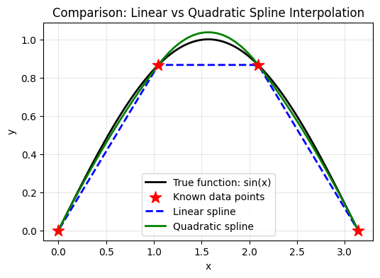
Quadratic spline is smoother and follows the curve better!
Cubic Splines: The Most Popular Choice#
A cubic spline uses cubic polynomials between each pair of adjacent points:
Why cubic? Consider what we need for a “smooth” curve:
Condition |
What it means |
Spline degree needed |
|---|---|---|
\(S_i(x_{i+1}) = S_{i+1}(x_{i+1})\) |
Continuous curve |
Linear (degree 1) |
\(S_i'(x_{i+1}) = S_{i+1}'(x_{i+1})\) |
Continuous slope |
Quadratic (degree 2) |
\(S_i''(x_{i+1}) = S_{i+1}''(x_{i+1})\) |
Continuous curvature |
Cubic (degree 3) |
Cubic is the minimum degree that gives continuous curvature — this makes the curve look natural and physically realistic.
Higher-order splines (quartic, quintic) give even smoother curves, but with diminishing returns and increased computational cost.
Using SciPy for Cubic Splines#
Implementing cubic splines from scratch requires solving a tridiagonal system of equations — doable but tedious. This is where libraries like SciPy shine!
Philosophy: Understand the principle first, then use well-tested libraries.
It’s risky to use a function without understanding what it does!
from scipy.interpolate import CubicSpline

# Compare polynomial vs cubic spline on Runge's function
n_points = 11
x_data_runge = np.linspace(-1, 1, n_points)
y_data_runge = runge_function(x_data_runge)

# Cubic spline
cs = CubicSpline(x_data_runge, y_data_runge)
y_spline = cs(x_fine)

# Polynomial
y_poly = [lagrange_interp(x_data_runge, y_data_runge, x) for x in x_fine]

plt.figure(figsize=(6, 4))
plt.plot(x_fine, y_true, 'b-', linewidth=2, label='True function')
plt.plot(x_fine, y_poly, 'r--', linewidth=2, alpha=0.7, label='Polynomial (degree 10)')
plt.plot(x_fine, y_spline, 'g-', linewidth=2, label='Cubic spline')
plt.plot(x_data_runge, y_data_runge, 'ko', markersize=8, label='Data points')

plt.xlabel('x')
plt.ylabel('y')
plt.title('Cubic Spline vs Polynomial Interpolation')
plt.legend()
plt.ylim(-0.5, 1.5)
plt.grid(True, alpha=0.3)
plt.show()

print("The cubic spline is much better behaved than the polynomial!")
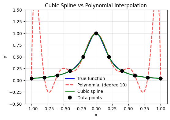
The cubic spline is much better behaved than the polynomial!
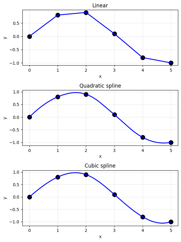
Types of Splines#
from scipy.interpolate import interp1d

# Compare different interpolation methods
x_data_demo = np.array([0, 1, 2, 3, 4, 5])
y_data_demo = np.array([0, 0.8, 0.9, 0.1, -0.8, -1.0])
x_fine_demo = np.linspace(0, 5, 200)

# Different interpolation methods
methods = [
    ('linear', 'Linear'),
    ('quadratic', 'Quadratic spline'),
    ('cubic', 'Cubic spline')
]

plt.figure(figsize=(6, 8))

for idx, (method, name) in enumerate(methods):
    plt.subplot(3, 1, idx + 1)

    f = interp1d(x_data_demo, y_data_demo, kind=method)
    y_interp = f(x_fine_demo)

    plt.plot(x_data_demo, y_data_demo, 'ko', markersize=10)
    plt.plot(x_fine_demo, y_interp, 'b-', linewidth=2)
    plt.xlabel('x')
    plt.ylabel('y')
    plt.title(name)
    plt.grid(True, alpha=0.3)

plt.tight_layout()
plt.show()
# Comprehensive comparison: Hand-implemented vs SciPy
from scipy.interpolate import interp1d

f = lambda x: np.sin(x)
x_min, x_max = 0, 2*pi
npt_known = 6

x_ideal = np.linspace(x_min, x_max, 200)
x_known = np.linspace(x_min, x_max, npt_known)
y_known = f(x_known)

# SciPy interpolation functions
f_linear_scipy = interp1d(x_known, y_known, kind='linear')
f_quad_scipy = interp1d(x_known, y_known, kind='quadratic')
f_cubic_scipy = interp1d(x_known, y_known, kind='cubic')

plt.figure(figsize=(6, 8))

plt.subplot(2, 1, 1)
plt.title('Hand-Implemented Methods')
plt.plot(x_ideal, f(x_ideal), 'k-', linewidth=2, label='True: sin(x)')

# Our implementations
x_interp = np.linspace(x_min + 0.01, x_max - 0.01, 100)
y_linear_hand = np.array([linear_interp(x_known, y_known, xi) for xi in x_interp])
y_quad_hand = np.array([quad_spline(x_known, y_known, xi, z0=1.0) for xi in x_interp])

plt.plot(x_interp, y_linear_hand, 'b--', linewidth=2, label='Linear (hand)')
plt.plot(x_interp, y_quad_hand, 'g-', linewidth=2, label='Quadratic (hand)')
plt.scatter(x_known, y_known, c='r', s=150, marker='*', zorder=5, label='Data points')
plt.legend()
plt.xlabel('x')
plt.ylabel('y')
plt.grid(True, alpha=0.3)

plt.subplot(2, 1, 2)
plt.title('SciPy Built-in Functions')
plt.plot(x_ideal, f(x_ideal), 'k-', linewidth=2, label='True: sin(x)')
plt.plot(x_ideal, f_linear_scipy(x_ideal), 'b--', linewidth=2, label='Linear')
plt.plot(x_ideal, f_quad_scipy(x_ideal), 'g-', linewidth=2, label='Quadratic')
plt.plot(x_ideal, f_cubic_scipy(x_ideal), 'm-.', linewidth=2, label='Cubic')
plt.scatter(x_known, y_known, c='r', s=150, marker='*', zorder=5, label='Data points')
plt.legend()
plt.xlabel('x')
plt.ylabel('y')
plt.grid(True, alpha=0.3)

plt.tight_layout()
plt.suptitle('Interpolation Methods Comparison', y=1.02, fontsize=14)
plt.show()

print("Key insight: Understanding the hand-implemented versions helps you choose")
print("the right scipy function for your application!")
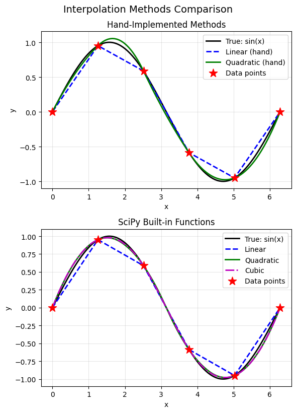
Key insight: Understanding the hand-implemented versions helps you choose
the right scipy function for your application!
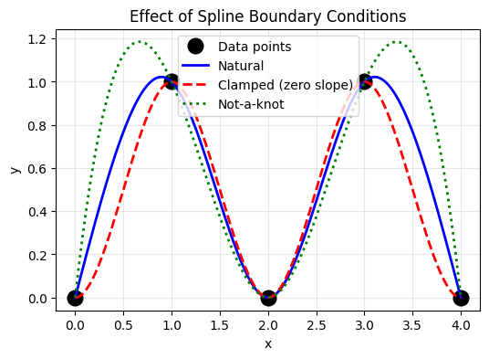
Spline Boundary Conditions#
The cubic spline has degrees of freedom at the boundaries. Common choices:
Natural spline: \(S''(x_0) = S''(x_n) = 0\) (second derivative is zero at ends)
Clamped spline: Specify \(S'(x_0)\) and \(S'(x_n)\)
Not-a-knot: Use same cubic polynomial for first two and last two intervals
# Compare different boundary conditions
x_bc = np.array([0, 1, 2, 3, 4])
y_bc = np.array([0, 1, 0, 1, 0])
x_fine_bc = np.linspace(0, 4, 200)

# Different boundary conditions
cs_natural = CubicSpline(x_bc, y_bc, bc_type='natural')
cs_clamped = CubicSpline(x_bc, y_bc, bc_type=((1, 0), (1, 0)))  # zero slope at ends
cs_notaknot = CubicSpline(x_bc, y_bc, bc_type='not-a-knot')

plt.figure(figsize=(6, 4))
plt.plot(x_bc, y_bc, 'ko', markersize=12, label='Data points')
plt.plot(x_fine_bc, cs_natural(x_fine_bc), 'b-', linewidth=2, label='Natural')
plt.plot(x_fine_bc, cs_clamped(x_fine_bc), 'r--', linewidth=2, label='Clamped (zero slope)')
plt.plot(x_fine_bc, cs_notaknot(x_fine_bc), 'g:', linewidth=2, label='Not-a-knot')

plt.xlabel('x')
plt.ylabel('y')
plt.title('Effect of Spline Boundary Conditions')
plt.legend()
plt.grid(True, alpha=0.3)
plt.show()
V. Using SciPy for Interpolation#
SciPy provides robust, well-tested interpolation tools.
# Summary of SciPy interpolation functions
print("Key SciPy Interpolation Functions:")
print("=" * 60)
print()
print("1D Interpolation:")
print("  np.interp()          - Simple linear interpolation")
print("  interp1d()           - Flexible 1D interpolation")
print("  CubicSpline()        - Cubic spline with boundary control")
print("  UnivariateSpline()   - Spline with smoothing option")
print()
print("2D Interpolation:")
print("  interp2d()           - 2D interpolation on grid")
print("  RectBivariateSpline()- 2D spline on rectangular grid")
print("  griddata()           - Interpolate scattered data to grid")
Key SciPy Interpolation Functions:
============================================================

1D Interpolation:
  np.interp()          - Simple linear interpolation
  interp1d()           - Flexible 1D interpolation
  CubicSpline()        - Cubic spline with boundary control
  UnivariateSpline()   - Spline with smoothing option

2D Interpolation:
  interp2d()           - 2D interpolation on grid
  RectBivariateSpline()- 2D spline on rectangular grid
  griddata()           - Interpolate scattered data to grid
# Practical example: interp1d with extrapolation
from scipy.interpolate import interp1d

x = np.array([0, 1, 2, 3, 4, 5])
y = np.sin(x)

# Create interpolation functions
f_linear = interp1d(x, y, kind='linear', fill_value='extrapolate')
f_cubic = interp1d(x, y, kind='cubic', fill_value='extrapolate')

# Evaluate (including extrapolation)
x_eval = np.linspace(-1, 6, 100)
y_true = np.sin(x_eval)

plt.figure(figsize=(6, 4))
plt.plot(x_eval, y_true, 'k-', linewidth=2, label='True: sin(x)')
plt.plot(x_eval, f_linear(x_eval), 'b--', linewidth=2, label='Linear')
plt.plot(x_eval, f_cubic(x_eval), 'r--', linewidth=2, label='Cubic')
plt.plot(x, y, 'ko', markersize=10, label='Data points')

# Mark interpolation vs extrapolation regions
plt.axvline(x=0, color='gray', linestyle=':', alpha=0.5)
plt.axvline(x=5, color='gray', linestyle=':', alpha=0.5)
plt.axvspan(-1, 0, alpha=0.1, color='red', label='Extrapolation')
plt.axvspan(5, 6, alpha=0.1, color='red')

plt.xlabel('x')
plt.ylabel('y')
plt.title('Interpolation vs Extrapolation')
plt.legend(loc='lower left')
plt.grid(True, alpha=0.3)
plt.show()

print("Warning: Extrapolation (outside data range) can be unreliable!")
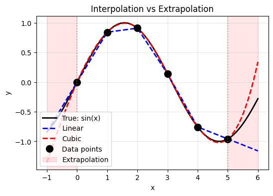
Warning: Extrapolation (outside data range) can be unreliable!
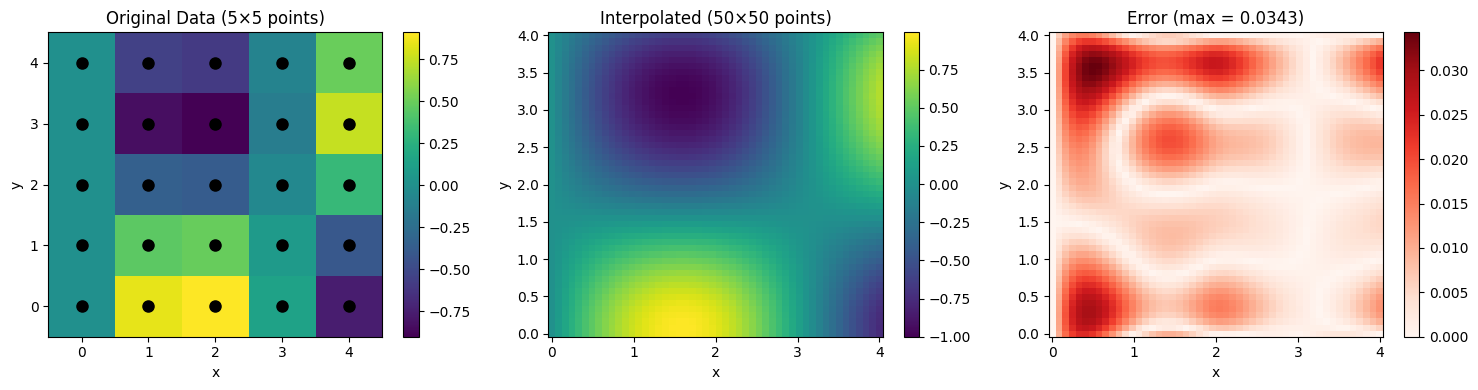
VI. 2D Interpolation#
Extend interpolation to surfaces: given \((x_i, y_j, z_{ij})\), find \(z(x, y)\).
from scipy.interpolate import RectBivariateSpline

# Create sample 2D data
x_2d = np.linspace(0, 4, 5)
y_2d = np.linspace(0, 4, 5)
X, Y = np.meshgrid(x_2d, y_2d)

# True function: z = sin(x) * cos(y)
Z_data = np.sin(X) * np.cos(Y)

# Create spline interpolator
spline_2d = RectBivariateSpline(x_2d, y_2d, Z_data.T)  # Note: transpose needed

# Evaluate on fine grid
x_fine_2d = np.linspace(0, 4, 50)
y_fine_2d = np.linspace(0, 4, 50)
Z_interp = spline_2d(x_fine_2d, y_fine_2d).T

# True values on fine grid
X_fine, Y_fine = np.meshgrid(x_fine_2d, y_fine_2d)
Z_true = np.sin(X_fine) * np.cos(Y_fine)

# Plot
fig, axes = plt.subplots(1, 3, figsize=(15, 4))

# Data points
ax1 = axes[0]
c1 = ax1.pcolormesh(X, Y, Z_data, shading='auto', cmap='viridis')
ax1.plot(X.flatten(), Y.flatten(), 'ko', markersize=8)
ax1.set_xlabel('x')
ax1.set_ylabel('y')
ax1.set_title('Original Data (5×5 points)')
plt.colorbar(c1, ax=ax1)

# Interpolated
ax2 = axes[1]
c2 = ax2.pcolormesh(X_fine, Y_fine, Z_interp, shading='auto', cmap='viridis')
ax2.set_xlabel('x')
ax2.set_ylabel('y')
ax2.set_title('Interpolated (50×50 points)')
plt.colorbar(c2, ax=ax2)

# Error
ax3 = axes[2]
error = np.abs(Z_interp - Z_true)
c3 = ax3.pcolormesh(X_fine, Y_fine, error, shading='auto', cmap='Reds')
ax3.set_xlabel('x')
ax3.set_ylabel('y')
ax3.set_title(f'Error (max = {error.max():.4f})')
plt.colorbar(c3, ax=ax3)

plt.tight_layout()
plt.show()
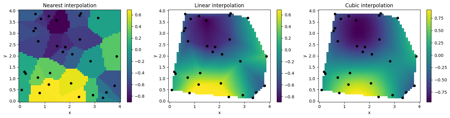
Interpolating Scattered Data#
For data not on a regular grid, use griddata().
from scipy.interpolate import griddata

# Generate scattered data points
np.random.seed(42)
n_scatter = 30
x_scatter = np.random.uniform(0, 4, n_scatter)
y_scatter = np.random.uniform(0, 4, n_scatter)
z_scatter = np.sin(x_scatter) * np.cos(y_scatter)

# Create regular grid for interpolation
x_grid = np.linspace(0, 4, 50)
y_grid = np.linspace(0, 4, 50)
X_grid, Y_grid = np.meshgrid(x_grid, y_grid)

# Interpolate using different methods
methods = ['nearest', 'linear', 'cubic']

fig, axes = plt.subplots(1, 3, figsize=(15, 4))

for ax, method in zip(axes, methods):
    Z_grid = griddata((x_scatter, y_scatter), z_scatter,
                      (X_grid, Y_grid), method=method)

    c = ax.pcolormesh(X_grid, Y_grid, Z_grid, shading='auto', cmap='viridis')
    ax.plot(x_scatter, y_scatter, 'ko', markersize=5)
    ax.set_xlabel('x')
    ax.set_ylabel('y')
    ax.set_title(f'{method.capitalize()} interpolation')
    plt.colorbar(c, ax=ax)

plt.tight_layout()
plt.show()
VII. Physics Applications#
1. Material Properties from Tables#
Many material properties are tabulated. Interpolation lets us use values at any temperature or pressure.
# Thermal conductivity of copper vs temperature (simplified data)
T_data = np.array([100, 200, 300, 400, 500, 600, 700, 800])  # K
k_data = np.array([482, 413, 401, 393, 386, 379, 373, 367])  # W/(m·K)

# Create interpolation function
k_interp = CubicSpline(T_data, k_data)

# Evaluate at desired temperatures
T_fine = np.linspace(100, 800, 200)
k_fine = k_interp(T_fine)

# Specific query
T_query = 350  # K
k_query = k_interp(T_query)

plt.figure(figsize=(6, 4))
plt.plot(T_data, k_data, 'ro', markersize=10, label='Tabulated data')
plt.plot(T_fine, k_fine, 'b-', linewidth=2, label='Cubic spline')
plt.plot(T_query, k_query, 'g*', markersize=15,
         label=f'k({T_query} K) = {k_query:.1f} W/(m·K)')

plt.xlabel('Temperature (K)')
plt.ylabel('Thermal Conductivity (W/(m·K))')
plt.title('Thermal Conductivity of Copper')
plt.legend()
plt.grid(True, alpha=0.3)
plt.show()

print(f"Thermal conductivity at T = {T_query} K: {k_query:.2f} W/(m·K)")
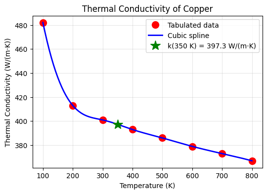
Thermal conductivity at T = 350 K: 397.32 W/(m·K)
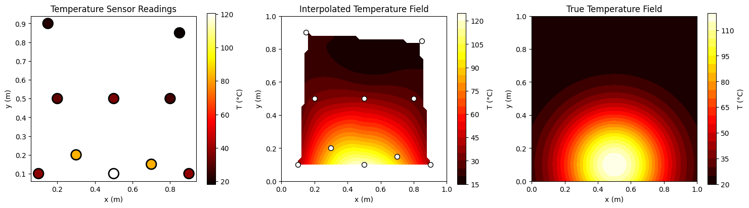
2. Temperature Field Interpolation#
Create a smooth temperature field from sensor measurements.
# Temperature sensors at various locations
np.random.seed(123)
sensor_x = np.array([0.1, 0.3, 0.5, 0.7, 0.9, 0.2, 0.5, 0.8, 0.15, 0.85])
sensor_y = np.array([0.1, 0.2, 0.1, 0.15, 0.1, 0.5, 0.5, 0.5, 0.9, 0.85])

# Temperature readings (simulating a heat source at center-bottom)
def true_temp(x, y):
    return 100 * np.exp(-((x-0.5)**2 + (y-0.1)**2) / 0.1) + 20

sensor_T = true_temp(sensor_x, sensor_y) + np.random.randn(len(sensor_x)) * 2

# Create grid for interpolation
grid_x = np.linspace(0, 1, 50)
grid_y = np.linspace(0, 1, 50)
Grid_X, Grid_Y = np.meshgrid(grid_x, grid_y)

# Interpolate temperature field
Grid_T = griddata((sensor_x, sensor_y), sensor_T, (Grid_X, Grid_Y), method='cubic')

# True temperature field
True_T = true_temp(Grid_X, Grid_Y)

fig, axes = plt.subplots(1, 3, figsize=(15, 4))

# Sensor locations
ax1 = axes[0]
scatter = ax1.scatter(sensor_x, sensor_y, c=sensor_T, s=200, cmap='hot',
                      edgecolors='black', linewidths=2)
ax1.set_xlabel('x (m)')
ax1.set_ylabel('y (m)')
ax1.set_title('Temperature Sensor Readings')
ax1.set_aspect('equal')
plt.colorbar(scatter, ax=ax1, label='T (°C)')

# Interpolated field
ax2 = axes[1]
c2 = ax2.contourf(Grid_X, Grid_Y, Grid_T, levels=20, cmap='hot')
ax2.scatter(sensor_x, sensor_y, c='white', s=50, edgecolors='black')
ax2.set_xlabel('x (m)')
ax2.set_ylabel('y (m)')
ax2.set_title('Interpolated Temperature Field')
ax2.set_aspect('equal')
plt.colorbar(c2, ax=ax2, label='T (°C)')

# True field
ax3 = axes[2]
c3 = ax3.contourf(Grid_X, Grid_Y, True_T, levels=20, cmap='hot')
ax3.set_xlabel('x (m)')
ax3.set_ylabel('y (m)')
ax3.set_title('True Temperature Field')
ax3.set_aspect('equal')
plt.colorbar(c3, ax=ax3, label='T (°C)')

plt.tight_layout()
plt.show()
VIII. Summary#
Methods Comparison#
Method |
Pros |
Cons |
Best For |
|---|---|---|---|
Linear |
Simple, stable, fast |
Not smooth |
Quick estimates, large datasets |
Polynomial |
Exact through all points |
Runge’s phenomenon |
Few points, Chebyshev nodes |
Cubic Spline |
Smooth, stable |
Requires solving system |
Most applications |
2D griddata |
Handles scattered data |
Can be slow |
Irregular sensor layouts |